Visual Identity has always been an important part of the Eurovision Song Contest, and here on this blog, we'll see the real values that the theme art of ESC brings to the audience.
Looping artwork of the Eurovision Song Contest 2012 (the on-air concept)
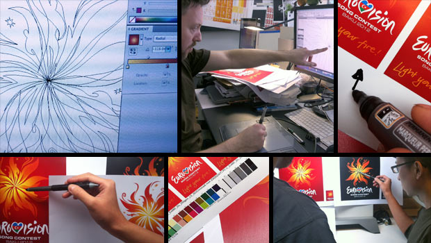
Following the success of their work on the Eurovision Düsseldorf identity in 2011, Turquoise Branding were invited back by Brainpool, the company producing Eurovision, to create the new identity for the Eurovision Song Contest 2012.
That year, the slogan would be: "Light your fire!", based on the slogan of the host country, Azerbaijan, "The land of fire!".
The inspiration and creation:
"Since the dawn of time, mankind has come together around fire to communicate through the telling of stories, song and dance. The Eurovision Song Contest is where people come together to celebrate and communicate through song and dance," the creators explained the idea behind the theme art.
The basic elements:
The basic elements of Eurovision Song Contest were: The main logo (Fire), the Eurovision marque and the strapline (Light your fire!).
It was associated with different backgrounds and other elements that we'll see below.
The strapline was made of hand-writing, but the font of that year would be "FF Sero", chosen for it's modern and unique type.
ESC 2012 Brand toolkit
The backgrounds:
The Eurovision Song Contest 2012 artwork was used in two main backgrounds:
In an white one with grey watermark and the red one with a darker red watermark, as shown below:
Some of the best usages:
Here you can watch the on-air design usage at the live show of the First Semi-final of the Eurovision Song Contest 2012 (On No Commentary) and enjoy the show! :)
NOTE:
All The used images are property of EBU/Ictimai. You must ask them for permission to use these images.
Looping artwork of the Eurovision Song Contest 2011 (the on-air concept)
"Feel Your Heart Beat!", this was the motto that was chosen for Eurovision Song Contest 2011 by NDR and Brainpool and that was led to the creation of its dynamic & energitic visual identity.
"A star was born."
"Consistent with the theme, the heart is the key
feature of the Eurovision Song Contest in Düsseldorf – a symbol which is
immediately recognised around the globe.
The idea was inspired by last year’s contest's Final in
Oslo, where the winner, Lena, during her conversation with the host Erik
Solbakken formed a heart with her fingers to thank all people who had voted for
her. Many representatives of other countries followed, adopting Lena’s gesture.
This year, the heart will be employed making use of
compelling animations - it consists of multi-coloured, pulsating rays of light.
Their function is to connect countries, people and their songs. They also
symbolise national flags in different colours."
The 2011th Eurovision Song Contest Theme Art.
It was the London-based branding agency "Turquoise Branding" which would create the visual identity for both on and off graphics, crafted around a heart-shaped marque, formed out of arcing streaks of multi-coloured lights.
It was designed to work as both an energetic and uplifting
static identity as well as a dynamic and engaging animation for all necessary
onscreen graphics.
Following the success with ESC 2011, Brainpool and the London-based branding agency "Turquoise Branding" would be invited by the Azeri national broadcasting channel "Ictimai TV" to produce the show and to create the visual identity next year, as Azerbaijan won the contest that year in Düsseldorf.
The Eurovision 2011 identity was honoured with an award for
innovationat the 13th International Eyes & Ears Awards 2011, and the Rose
d’Orfor Best Live Event Show at the Global Entertainment Television Festival.
The basic elements:
The basic elements of the Eurovision Song Contest 2011 Theme Art would be: 1. The heart marque, 2. The Eurovision Song Contest (logo) marque and 3. the slogan "Feel your heart beat!".
The font that was used for the strapline would be "Avant Garde Book", and it was chosen for it's extravagant and modern design, that would go side by side with the brand ID of that year contest.
At the live shows, before the performing act, it was shown the theme art of that year, stylized with the colours of the performing country.
You can check the opening titles (on-air design) at the video below.
Best usages of the visual identity (both on and off air):
Bonus: social network cover and smartphone and tablet wallpapers, with the theme art for the Eurovision Song Contest 2011:
If you missed or want to rewatch the Grand Final of the ESC 2011 (on HD and No Commentary) here's the video on YouTube:
All the images above are property of NDR and EBU.
Covers and Wallpapers are created under the permission from the respective owners. Special thanks to NDR. NOTE: I've set the comment setting for everyone to comment, so you can leave your impressions here without having to sign in with your account.
This years Eurovision Song Contest chosen slogan was "Building Bridges", to show the whole world that one of this contest "jobs" is to build bridges between people from every ethnicity, culture, nation etc.
(And by the way, ESC has successfully fulfilled this mission, so well done!)
Differently form other years, this year, EBU surprisingly presented the Eurovision Song Contest 2015 artwork in late November, making a big surprise for all the Eurovision Song Contest fans worldwide who were expecting this in late December or January.
"Celebrating 60 years of the Eurovision Song Contest in the world’s music capitol, Vienna – where else? This year, the ESC will take place in the centre of Europe, with the theme of “Building Bridges”. The graphic appearance visually interprets this year’s motto, showing constantly-forming relationships that allow for new encounters: Emanating from Vienna, and spreading across Europe, every single contribution acts as a building block to a pan-European event which, having been unified from many single pieces, will form a trans-border arc to the biggest TV show in Europe. This diversity is independently and clearly represented in the graphic appearance. The entire colour spectrum of the rainbow along with the seemingly alive, dynamic and musical bridges, composed of thousands of unique parts spanning the entirety of Europe, reflect the positive diversity of all artists, of the variety of their songs as well as the diversity of the audience itself and the visibly-lived tolerance they demonstrate during the event. The logo, called “The Sphere”, captures this “DNA”, emphasises the thought behind creating the bridges and symbolises, through the shape of a three-dimensional globe, the endless versions of this diversity. The clear combination of shapes and colours defines a compact visual symbol and subsequently creates a strong and unique branding for the 60th Eurovision Song Contest."
At first, many Eurovision fans found the artwork similar to the one from past years, such as ESC 2011 (background), ESC 2010 (the spheres) and JESC 2011 (the main logo).
But after the full artwork was presented, it wasn't anything more, but just one of the most unique theme arts that Eurovision Song Contest has ever had.
The full artwork of the Eurovision Song Contest 2015.
Color Range of the ESC 2015 artwork.
The full artwork of ESC 2015 contains: the light from above, the "sphere", the "wave" and the map of the Europe, stylized with the gradient with the official colors of ESC 2015 artwork.
The basic elements:
"These are the basic elements from which the Eurovision Song Contest 2015 logo is built –
the official generic Eurovision Song Contest 2015 logo, our motto ‘Building Bridges’ and
our main graphical element called "The Sphere". These elements composed together build
our official logo and should not be separated from each other in any way."
Some other elements were also:
The Europe map (which has served as the background of the ESC 2015 artwork):
The wave:
The light:
etc.
For the 3rd time in a row, the font of the official ESC 2015 artwork was "Gotham".
The types that were used were: Light, Book, Medium and Bold.
In the LIVE shows, before the postcard sequence, it was shown an looping-image of ESC 2015 artwork, stylized with the colors of the country that was about to perform.
(e.g. Sweden)
Opening intro:
The intro of ESC 2015 consisted of waves travelling through famous places and monuments in Vienna, coloured and stylized with the theme of ESC 2015, of course.
Here's the video:
Here are some "best practicing" of this years artwork:
In case you missed or want to rewatch the three live shows, you can check them out on YouTube (on Full HD and No Commentary):
All the images used here, are property of ORF and EBU.
The "" text is taken from the official ESC 2015 Graphic Guidelines,


