07 January, 2016

We are one.

The on-air concept of ESC 2013 brand.
We all love butterflies. Don't we? They are all beautiful, full of colours and of course, unique.
But did you know that these beautiful, full of colours and unique butterflies, with a single flap they can start a hurricane? Well, you know now. This was the concept of ESC 2013 brand.

ESC 2013 main logo on a white background.
THE BUTTERFLY EFFECT

Eurovision Song Contest is a shared
project. It unites millions of people.
In the east, west, north and south. Beyond
all the glitter, there is a thought.
A big idea that is 100% relevant for
Public Service. It’s about togetherness,
diversity and happiness. Eurovision
Song Contest might appear as a trivial
matter. But a trivial matter that engages
over one hundred million people of all
ages in more than 40 countries all over
the world. And today science knows
that sometimes small matters can start
powerful and big movements. This
phenomenon is called ”The Butterfly
Effect”. A flap from one butterfly can
– at least in theory – start a hurricane.
Butterflies have one common name, but
exist in thousands of different shapes
and colours. Just like the Eurovision
Song Contest, one strong identity

with a rich national diversitiesy. Working
together, we can achieve anything
– We are one.


The 39 competing nations were given their own butterfly, inspired by their flag.


Creation

According to chaos theory, the single flap of a butterfly’s wing can start a hurricane. With this in mind, Happy F&B created their ‘butterfly effect.’ Colourful and playful, the butterflies came to symbolize the nations present. The main symbol for Eurovision Song Contest – a butterfly, of course – was a dazzling mix of all the different colours on display.


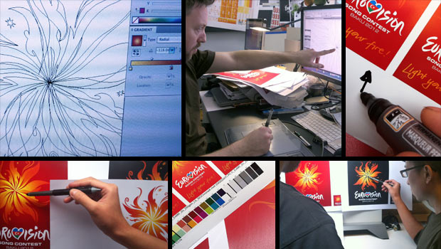
As usually, the three main elements of the ESC 2013 theme art were the Eurovision marque, the strap line and of course, the artwork.


The main colours used to create the theme art are as shown in the image above, and for the first time ever, the "Gotham" font would be used for the slogan.


The background with splashed red and black colours was yet another elements of this brand identity.

How was the brand ID used? Well, check it out yourself in the following images. :-)


19 October, 2015

Eurovision 2012 — Light your fire!

Looping artwork of the Eurovision Song Contest 2012 (the on-air concept)

Following the success of their work on the Eurovision Düsseldorf identity in 2011, Turquoise Branding were invited back by Brainpool, the company producing Eurovision, to create the new identity for the Eurovision Song Contest 2012.

That year, the slogan would be: "Light your fire!", based on the slogan of the host country, Azerbaijan, "The land of fire!".

The inspiration and creation:

"Since the dawn of time, mankind has come together around fire to communicate through the telling of stories, song and dance. The Eurovision Song Contest is where people come together to celebrate and communicate through song and dance," the creators explained the idea behind the theme art.


The basic elements:


The basic elements of Eurovision Song Contest were: The main logo (Fire), the Eurovision marque and the strapline (Light your fire!).
It was associated with different backgrounds and other elements that we'll see below.
The strapline was made of hand-writing, but the font of that year would be "FF Sero", chosen for it's modern and unique type.
ESC 2012 Brand toolkit

The backgrounds:

The Eurovision Song Contest 2012 artwork was used in two main backgrounds:
In an white one with grey watermark and the red one with a darker red watermark, as shown below:

Some of the best usages:


Here you can watch the on-air design usage at the live show of the First Semi-final of the Eurovision Song Contest 2012 (On No Commentary) and enjoy the show! :)


NOTE:
All The used images are property of EBU/Ictimai. You must ask them for permission to use these images.


25 June, 2015

Feel your heart beat!


Looping artwork of the Eurovision Song Contest 2011 (the on-air concept)

"Feel Your Heart Beat!", this was the motto that was chosen for Eurovision Song Contest 2011 by NDR and Brainpool and that was led to the creation of its dynamic & energitic visual identity.


"A star was born."


"Consistent with the theme, the heart is the key feature of the Eurovision Song Contest in Düsseldorf – a symbol which is immediately recognised around the globe.
The idea was inspired by last year’s contest's Final in Oslo, where the winner, Lena, during her conversation with the host Erik Solbakken formed a heart with her fingers to thank all people who had voted for her. Many representatives of other countries followed, adopting Lena’s gesture.

This year, the heart will be employed making use of compelling animations - it consists of multi-coloured, pulsating rays of light. Their function is to connect countries, people and their songs. They also symbolise national flags in different colours."

The 2011th Eurovision Song Contest Theme Art.

It was the London-based branding agency "Turquoise Branding" which would create the visual identity for both on and off graphics, crafted around a heart-shaped marque, formed out of arcing streaks of multi-coloured lights.
It was designed to work as both an energetic and uplifting static identity as well as a dynamic and engaging animation for all necessary onscreen graphics.
Following the success with ESC 2011, Brainpool and the London-based branding agency "Turquoise Branding" would be invited by the Azeri national broadcasting channel "Ictimai TV" to produce the show and to create the visual identity next year, as Azerbaijan won the contest that year in Düsseldorf.

The Eurovision 2011 identity was honoured with an award for innovationat the 13th International Eyes & Ears Awards 2011, and the Rose d’Orfor Best Live Event Show at the Global Entertainment Television Festival.


The basic elements:


The basic elements of the Eurovision Song Contest 2011 Theme Art would be: 1. The heart marque, 2. The Eurovision Song Contest (logo) marque and 3. the slogan "Feel your heart beat!".

The font that was used for the strapline would be "Avant Garde Book", and it was chosen for it's extravagant and modern design, that would go side by side with the brand ID of that year contest.

At the live shows, before the performing act, it was shown the theme art of that year, stylized with the colours of the performing country.


You can check the opening titles (on-air design) at the video below.


Best usages of the visual identity (both on and off air):


Bonus: social network cover and smartphone and tablet wallpapers, with the theme art for the Eurovision Song Contest 2011:


If you missed or want to rewatch the Grand Final of the ESC 2011 (on HD and No Commentary) here's the video on YouTube:


All the images above are property of NDR and EBU.
Covers and Wallpapers are created under the permission from the respective owners.
Special thanks to NDR.

NOTE: I've set the comment setting for everyone to comment, so you can leave your impressions here without having to sign in with your account.