 |
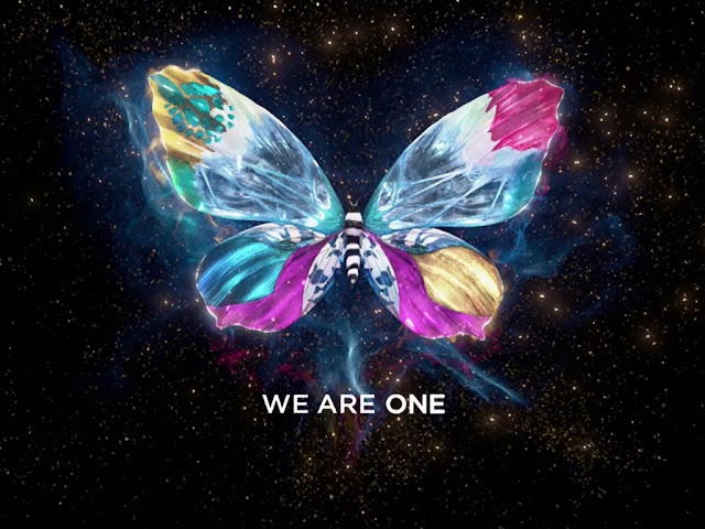
| The on-air concept of ESC 2013 brand. |
But did you know that these beautiful, full of colours and unique butterflies, with a single flap they can start a hurricane? Well, you know now. This was the concept of ESC 2013 brand.
 |
| ESC 2013 main logo on a white background. |
Eurovision Song Contest is a shared
project. It unites millions of people.
In the east, west, north and south. Beyond
all the glitter, there is a thought.
A big idea that is 100% relevant for
Public Service. It’s about togetherness,
diversity and happiness. Eurovision
Song Contest might appear as a trivial
matter. But a trivial matter that engages
over one hundred million people of all
ages in more than 40 countries all over
the world. And today science knows
that sometimes small matters can start
powerful and big movements. This
phenomenon is called ”The Butterfly
Effect”. A flap from one butterfly can
– at least in theory – start a hurricane.
Butterflies have one common name, but
exist in thousands of different shapes
and colours. Just like the Eurovision
Song Contest, one strong identity
with a rich national diversitiesy. Working
together, we can achieve anything
– We are one.

The 39 competing nations were given their own butterfly, inspired by their flag.
Creation
According to chaos theory, the single flap of a butterfly’s wing can start a hurricane. With this in mind, Happy F&B created their ‘butterfly effect.’ Colourful and playful, the butterflies came to symbolize the nations present. The main symbol for Eurovision Song Contest – a butterfly, of course – was a dazzling mix of all the different colours on display.
As usually, the three main elements of the ESC 2013 theme art were the Eurovision marque, the strap line and of course, the artwork.
The main colours used to create the theme art are as shown in the image above, and for the first time ever, the "Gotham" font would be used for the slogan.
The background with splashed red and black colours was yet another elements of this brand identity.


